The many and varied University of Twente logos
In 2009, the old University of Twente logo and wordmark were replaced by ‘just’ a wordmark. Never had an adjustment to a house style caused so much fuss...
The design of the university’s first-ever logo, when it was still Twente Technical College, was formed out of the letters THT, representing the college’s Dutch name Technische Hogeschool Twente. The Ts were worked into the empty spaces of the H to form a simple, streamlined logo that was often (although less so as the years passed) combined with the wordmark Technische Hogeschool Twente.

Of course, when Technische Hogeschool Twente was renamed University of Twente in 1986 the classic logo had to be retired. The new logo made use of a dynamic interplay of blue circles and triangles – a typically ’80s logo. Another big change was the addition of the tagline ‘the entrepreneurial university’ to the ‘University of Twente’ wordmark.
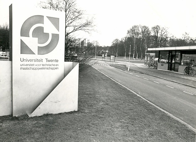
The designers of the new logo bore the responsibility of making it express several different symbolic meanings. The final design was based around two circles that represented the university’s two cores: both technological and social sciences. The triangles pointed both outwards and inwards, symbolizing the interaction between the University of Twente and wider society. The outward-pointing triangles showed how the university aimed to present itself to society: service-oriented, market-focused and centred on practical applications, while the inward-pointing triangles represented the connection between the two cores. The logo was affectionately known in the university community as ‘the blue knot’.
In 2009, the University of Twente adopted a new branding strategy that entailed a change to the house style, including getting rid of the logo, the wordmark and the motto ‘the entrepreneurial university’. All the traditional rules for the creation of a corporate identity were thrown out: a logo was deemed unnecessary – a wordmark would be sufficient on its own – and instead of a single standard house style the university decided to present an identity made up of several different elements that would not all be deployed together. The foundation of all university communications was the wordmark UNIVERSITY OF TWENTE. (full stop!). The extra house style elements became known within the university as friemels (‘fiddly bits’). So what was the reasoning behind getting rid of the motto ‘the entrepreneurial university’? Well, if you actually are entrepreneurial, you shouldn’t need to say it out loud.

Although the Executive Board welcomed the new house style as ‘refreshing, very innovative and a style that is stimulating, fascinating and distinctive’, it faced growing dissatisfaction among both students and lecturers. Lecturer Jurriaan Huskens wrote an open letter to the UT Nieuws (newspaper of University of Twente) in which he stated his view that a lot of money had been spent ‘not to develop a new logo, but to get rid of the current one’. There was open resistance to the new house style on campus, too, with posters being put up in the new house style but with the distinctive old logo.
The question of whether the new house style had cost too much money even made it into the national media. It was reported that the change would cost €3 million, prompting Minister Plasterk to bring the matter up in the Dutch House of Representatives. He called it ‘a significant outlay’ and, although he said he understood that the Executive Board was responsible for promoting a ‘respectable, professional presentation’ of the university, he did feel that it befitted a publicly-financed scientific institute to show a certain ‘soberness and economy’. Executive Board spokesperson Paul van Tongeren described the new house style as a worthwhile depth investment that would raise the profile of the University of Twente. It should be seen as a statement. Van Tongeren also remarked that developing the house style and acquiring the copyright had cost a total of €600,000. The remaining €2.2 million was to pay for associated updates to business cards, stickering on vehicles, new signs on buildings and so on.
Still, that’s an awful lot of money for a few letters and a full stop.