Researchers of the faculty of ITC published a set of maps that provide a general-purpose and easy-to-understand overview of the COVID-19 pandemic. The maps are a result of their research in the mapping of epidemics and pandemics and are free to use by anyone.
“Pandemics are hard to map accurately and easy-to-understand”, says Franz-Benjamin Mocnik, one of the creators of the map. Different locations, such as two neighbouring provinces, can have a number of cases in completely different orders of magnitude. This challenge can be overcome by using disks instead of any linear way of representation, because the area of a disk is quadratic in the diameter and it thus naturally scales better for the large numbers.
OVERVIEW
The maps created by Mocnik and his colleagues show the SARS-CoV-2 infections, deaths and recoveries of different countries and through time, making it easy to see where the pandemic has just started and where it has reached its peak. By graphing the infections on one axis and the number of deaths on the other axis, you can quickly see the mortality rate and where the pandemic is accelerating, staying constant and where it is coming to a halt. In addition to these numbers, the number of recovered people is displayed in green. “It is important to also communicate that there is hope”, says Mocnik.
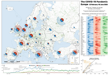
Figure 1: A map showing the COVID-19 cases of Europe
COMPLETE FIGURE
The current pandemic affects large parts of the world and its development in space and time is complex. This highlights the importance to communicate the complete figure to medical professionals and policy makers who need insight in the data. “Besides professionals, the maps can be especially useful for print media like magazines and newspapers”, says Mocnik, “These maps help communicating where hotspots of the pandemic are and how they develop over time.” Only when these aspects are set into a mutual context, the numbers are connected into a coherent story of the ongoing COVID-19 pandemic.
MORE INFORMATION
The maps are part of a publication titled “Epidemics and pandemics in maps – the case of COVID-19”, which has been published in the Journal of Maps and can be read online. The maps are open access and free to use. The researchers, Franz-Benjamin Mocnik, Paulo Raposo, Wim Feringa, Menno-Jan Kraak and Barend Köbben are all part of the Department of Geo-Information Processing (GIP; faculty of ITC).
DOI: 10.1080/17445647.2020.1776646

On the 8th July, Menno-Jan Kraak was a guest at Radio talkshow 1Twente Vandaag to talk about this research (In Dutch; starts at 45:30).


