General information about how the UT visual identity is set up, what elements are used and how it visualises our story.
The University of Twente is a pioneer in connecting technology, science and engineering with social sciences in order to make a difference in the world around us. In order to present our education and research in the market, it is important that all of the elements are clearly recognisable as representing the University of Twente.
To profile this brand, all of the elements are processed under the main brand of the University of Twente. The visual identity of the brand is characterised by a sleek, no-nonsense logo, the clean spatial divisions and the use of the totality of elements that represent the various aspects of the university. How this identity is created and the principles which are centralised therein are set out in the rationale.
About UT visual identity
The visual identity is split into several building blocks which collectively provide an unambiguous and recognisable appearance when correctly applied. For logo downloads and templates, see the Downloads & Templates page.
- Handbook Visual Identity
The corporate identity comprises the logo, the totality of elements, the colour palette, the spatial divisions and the use of images . Also, you can read through an explanation of our brand architecture.
 .
. - Totality: the base of our visual identity
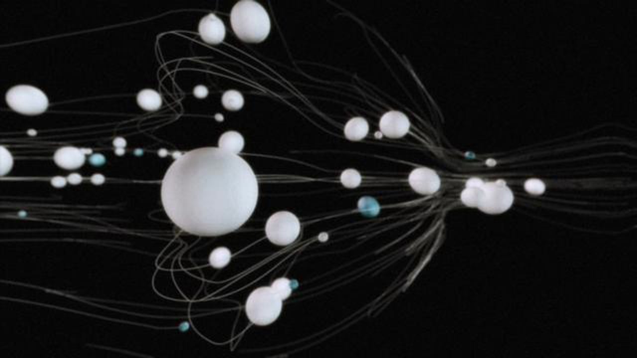
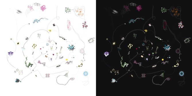
The visual identity is characterised by a diversity of forms and elements, the so-called ‘totality’. This totality is made up of a variety of connecting elements, inspired by the versatility that characterises the UT; i.e. the campus and a spectrum of education, research and and entrepreneurialism.
The designer has the freedom to determine the level of zoom on the totality and, as a result, there are many options for using the elements in communication materials. Only the institutes and University College Twente have their own elements. Courses, units and departments may continuously vary the elements.
For moreinformation about the usage of the elements within the totality, please contact our Traffic deparment.
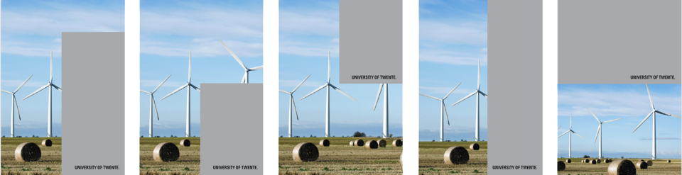
- University of Twente corporate logo
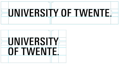
The University of Twente exclusively communicates the English-language logo, which is available in two variants, i.e. in a single line and a stacked variant. The single line variant is preferred. If the space available for the logo is so narrow that the logo becomes illegible, there is an alternative form. We refer to this as the ‘stacked’ version. In principle, this version is not used for house-style applications for the University of Twente. It is intended to be used in exceptional circumstances and only if the preferred version cannot be used due to limited space.
When positioning the logo, you must ensure that:
- there is adequate white space around the logo;
- the colour of of the logo (white/black) is harmonised with the background to create a good contrast;
- the logo is placed at the bottom-right in any communication materials.
You can download the logo in the various forms.
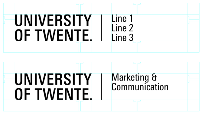
- University of Twente combination logo's
corporate combination logo
The University of Twente corporate combination logo is exclusively intended for faculties, services and professional groups. This combination logo is available on request via the Traffic department.
For designers this means when positioning the logo, you must ensure that:
- there is adequate white space around the logo;
- the colour of of the logo (white/black) is harmonised with the background to create a good contrast;
- the logo is placed at the bottom-right in any communication materials.
other combination logo's
For other combination logo's see text below about the brand architecture.
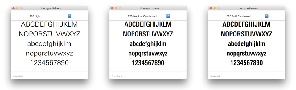
- Font: Linotype Univers
The font is a characteristic component of the university’s visual identity. The standard font for the University of Twente is the Linotype Univers. Within this family of letters, a wide range of variants is available; we use the variant ‘Linotype Univers 330’ for plaint text and ‘Linotype Univers 620/520’ for headings/sub-headings. A licence is required to use ‘Linotype Univers’; for any questions please contact Traffic department.
If ‘Linotype Univers’ cannot be used, the font ‘Arial’ and ‘Arial Narrow’ can also be used.
- Colour palette
The colour palette of the visual identity is characterised by a broad spectrum of colours, which provides plenty of variation. Every coloured section and element may use one colour from the palette. Exceptions to this are corporate publications which can only use black or white colour sections, and research institutes which use their own colour, logo and element.
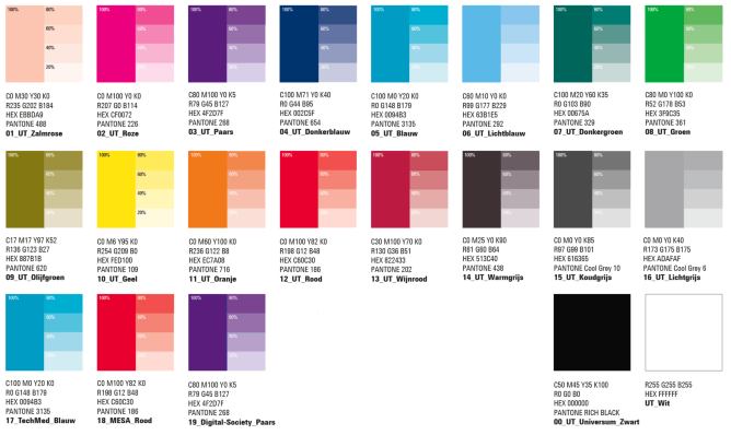
Download the colour palette.
The colour palette is available as a .
Brand architecture
The brand architecture sets out how we present ourself to the outside world, and from which unit. Corporate, services, faculties and courses communicate largely using the main brand of the University of Twente. Three research institutes have their own profiling within the brand architecture; TechMed Centre, MESA+ Institute and the Digital Society Institute. They are clearly part of the University of Twente family but profile themselves with their own variant of the logo when communicating with the outside world. The logos, colours and elements have been set out for these sub-brands.
Over the years, there have also been icon projects which, as a result of the attention value, have had their own temporary appearance. An icon project needs approvement from the Executibe Board.
For logo downloads and templates, see the Downloads & Templates page.